In the first part of the year 2020 we were told that mostly old people get infected by Covid-19. Now we are told that young people are the ones who spread infection around. So, which is it? One of the best things in this digital age is that you can check the real situation by yourself with open data and open-source tools.
I am using the same data source from Lithuanian Open Data Portal to investigate situation on age. Age of cases is provided in ranges only.
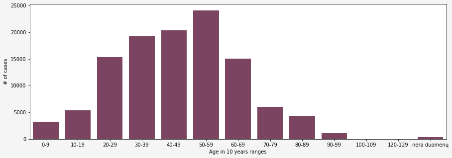
However, gapped data is not very useful for further analysis. So, I converted each range to a number, choosing the middle value. For instance, in a range [0;9] the middle value would be 4,5.
With this modification I wanted to see if there is any change in ages of people who get sick over time. If I would draw a scatter plot for this data it would be grouped and plotted like dots in a line as I have just one number for each 10-year interval. Hence, I decided to add some random noise to my scatter plot to have a smoother plot.
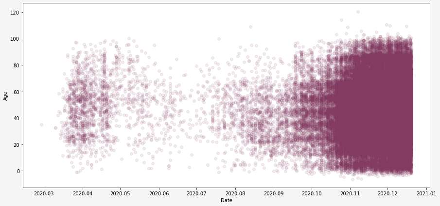
From the Scatter plot above we see that really, at the beginning of the year there were actually more older people diagnosed with Covid-19 compared to younger ones. However currently (in the end of the year) the difference is gone.
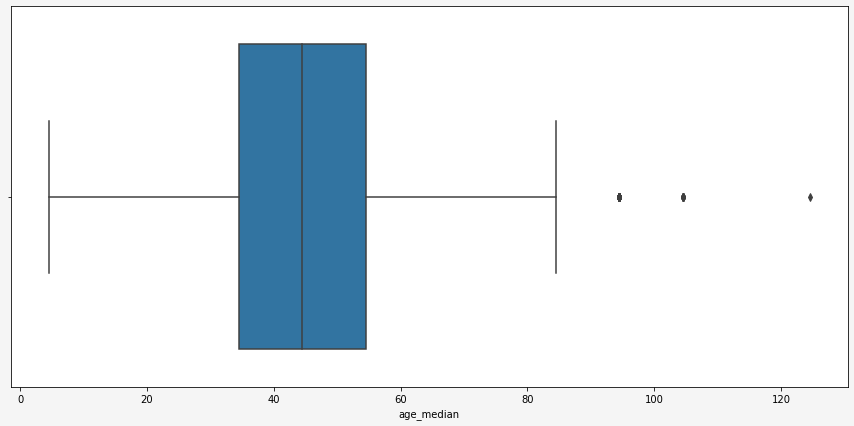
From both plots above, we can guess that there are some outliers in the data. The easiest way to investigate them is to plot a boxplot which shows mean, standard deviation, quantile, and outliers. Hence from the plot below we find 3 age outliers: people in the age range ‘90-99’, ‘100-109’, ‘120-129’. I have removed for now these ranges from my data set for further analysis.
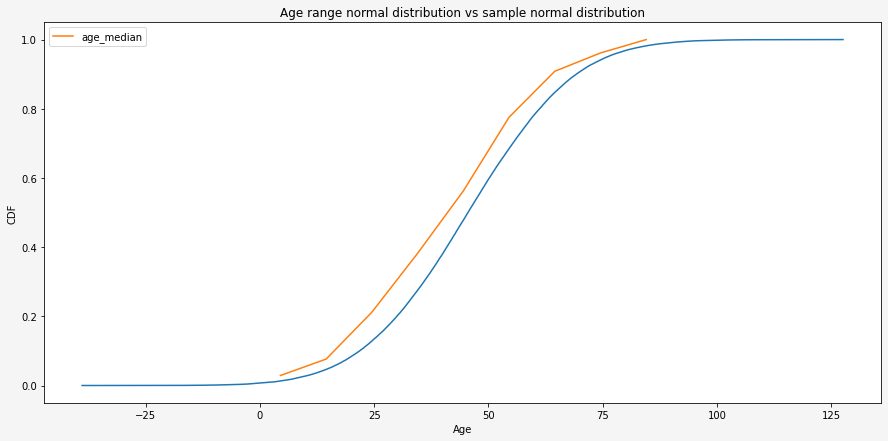
Now, with my cleaned new data set without missing data and outliers, I can plot the Cumulative distribution function. For this, I have used Python package <empiricaldist>.
It came as no surprise that infected people age is distributed very close to Normal distribution as a lot of things in our life can be described by it. This can quite clearly be seen from a plotted random Normal distribution line with the same mean and standard deviation. The mean age of the dataset is 45.426437 and std is 18.531993. It means that people of the age of 45 (in range 40 to 49) +/- 18 years comprise the majority of all infected people.
Ok, we all see that gap between two distribution lines. All the results should be summarized like “It could be normal distribution”. There are many ways to test if the dataset is distributed by the normal distribution. I have chosen D’Agostino and Pearson’s Test. The code is in my GitHub profile. The result of the test is:
Statistics=1965.933, p=0.000
Sample does not look Gaussian (reject H0)
My data set provides data on a few other parameters on the infected person:
- what was the outcome
- if the person was hospitalized (yes/no)
- if the person was treated in intensive care (yes/no)
- if the person had chronic diseases before acquiring Covid-19 (yes/no)
I converted categorical columns to numeric using <.cat.codes> method and calculated the correlation matrix.
Correlation matrix is a table showing correlation coefficients between two variables. Keep in mind that correlation do not show causation. It only shows how strong is linear relationship between variables. The value of correlation coefficient is between -1 and 1 and if correlation is around 0 it means that correlation is weak.
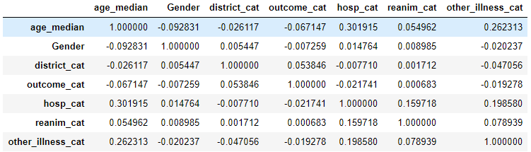
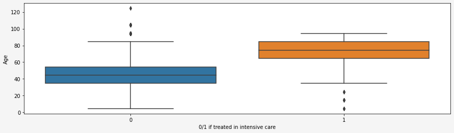
From the correlation matrix we see that there is no strong liner relationship between age range and other variables. However, it does not mean that there is no relationship. I still had a feeling that age should have a relationship with the variable showing if the person was/is treated in intensive care. The boxplot below shows that older people are actually more likely to be treated in intensive care than younger ones.
For now, this is it. In other post I will go to deeper.