Data cleaning
Covid-19 data serves perfectly for learning Python. There are many sources with Covid-19 data. As a start I decided to use Lithuanian open data portal. It provides data on testing results and positive cases by gender and age. File is available in .CSV and .JSON formats.
For analysis, I used epidemiological data published here
To visualize correctly current situation in Lithuania, I needed to clean data a bit.
- Source has two columns of date: “Start of sickness” and “Positive test date”.
- I used
<pd.to_datetime>to convert string type to date type
- I used
- Gender column had empty values so I changed it to “unknown”. Also “female” was written in two different ways, so I changed to have uniform defitinion here.
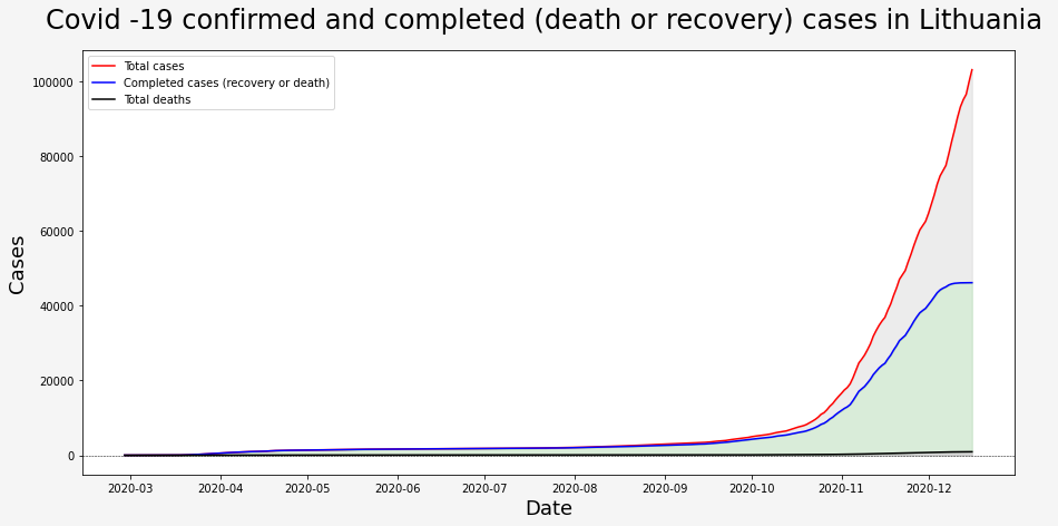
This data set has information about outcome of each case. The values is this column are:
- Gydomas - currently sick
- Pasveiko - recovered
- Mirė - died
- Kita - other
- Nesirgo - was never sick
- … - unknown
I removed values “was never sick” with an assumption that this data was accidentally put into data set.
To visualize current situation in Lithuania I calculated running sum for each type of end case as my data set has only new entries foreach day. I did it using <.cumsum(skipna = True)> method. For the visualisation below I used <matplotlib.pyplot>
Data Visualisation
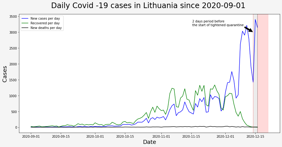
Even though the old government said that everything is under control we can clearly see that from the start of September until new government started its work on 2020-12-11 (Friday), numbers of new cases were growing too fast to call it controlable. We will see if new actions taken by the new government would have better success.
I am starting to believe that there are two groups of pleople in the world. One, who believe that Earth is round and others, who believe that Earth is flat. People who believe that Earth is flat deny science. When I hear people say “Christmas presents for the family and friends are more important than scientists’ request to stay at home” - I automatically put them to the Flat Earth group…
I marked the period of 2 days before the start of tightened quarantine in gray and a 5 days period in red. (it takes on average 5 days to feel symptoms after contact with person infected with Covid-19.
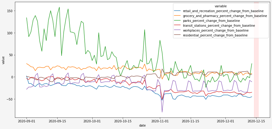
Google provides mobility data for all over the world. To load full .csv file requires a lot of memory resources. So I loaded file by chunks and filtered data I needed:
mobility_csv_file = 'https://www.gstatic.com/covid19/mobility/Global_Mobility_Report.csv'
c_size = 5000

mobility_dataLT = None
for chunk in pd.read_csv(mobility_csv_file,chunksize=c_size, parse_dates=['date']):
    chunk_result =  chunk[chunk['country_region']=="Lithuania"]

    if mobility_dataLT is None:
        mobility_dataLT = chunk_result
    else:
        mobility_dataLT = mobility_dataLT.append(chunk_result)
These Community Mobility Reports aim to provide data of mobility changes in response to policies aimed at combating COVID-19. I am really interested to see how will it look on the period that I marked red. Hopefully data will be sensitive enough to catch the situation for the period of 2 days before the start of tightened quarantine.
I will update graphs bi-weekly or you can find python code in my github repository.